Tattoos, road signs and typefaces: how design shapes what we understand
By Emily Halloran
There’s a tattoo out there that someone paid hundreds for, but no one can actually read what it says. There’s a road sign that confused a driver long enough to miss their exit. And there’s probably a PowerPoint circulating your office right now that looks great but communicates almost nothing.
What do they all have in common? Legibility – how easy a typeface is to read (rather than readability which is about how easy a text is to understand).
In a world full of messages, the ones that stick – the ones that work – are the ones people can actually read. Clear design isn’t a matter of taste. It’s part of effective communication.
And if you’re wondering why we aren’t talking about fonts, please excuse our jargon. A typeface is a group of designed letters, numbers and symbols (think of the Arial family). Fonts are the different styling that gets applied to the typeface (think of Arial Bold Italic).
Tattoos: meaning versus style
A tattoo is one of the most permanent messages you can send, so why are so many of them illegible? Alex Harrell answers with a question of their own: ‘If typography isn’t intended to convey emotional expression and is strictly for communicating, why don’t wedding planners design invitations with Comic Sans? Why are text-based tribute tattoos to Ernest Hemingway designed to resemble Courier?’
For tattooists, there is a clear tension between form and function. Clients want something that looks like art but is also legible – otherwise the tattoo loses some of its meaning.
Road signs: split-second impact
When should you prioritise function over form? When readers need to understand your message at speed, in bad weather and from far away. In other words, on road signs.
Australian road signs use the typeface unofficially known as Highway Gothic. The United States Federal Highway Administration intended this typeface to be simple and highly legible, with plenty of space between and in letters.
With simplicity in mind, road signs are an exercise in restraint. Too much information or poor layout will confuse, distract and frustrate drivers.
Writing at work: typefaces and plain language
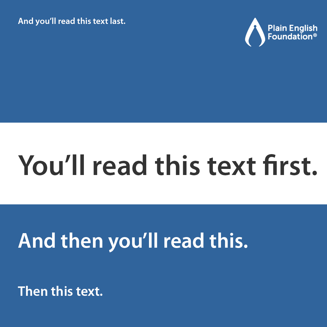
Design your message like a road sign – seen at speed, acted on quickly. Don’t make your readers slow down, squint or guess. For example, some typefaces have letters, numbers or symbols that are easily confused:
- clear or dear
- burn or bum
- 5AM or SAM
- corn or amazon.com
- 0 or O
- 1 or I.
To keep your message clear, we recommend:
- avoiding italics, which interrupt a reader’s flow
- choosing a sans serif typeface for digital content (Vision Australia suggests Calibri, Verdana or Tahoma)
- using colours that pass colour contrast – you can check this online
- including spacing between letters, lines and paragraphs
- guiding readers’ eyes by using different sizes, weights (bolding) and colours.
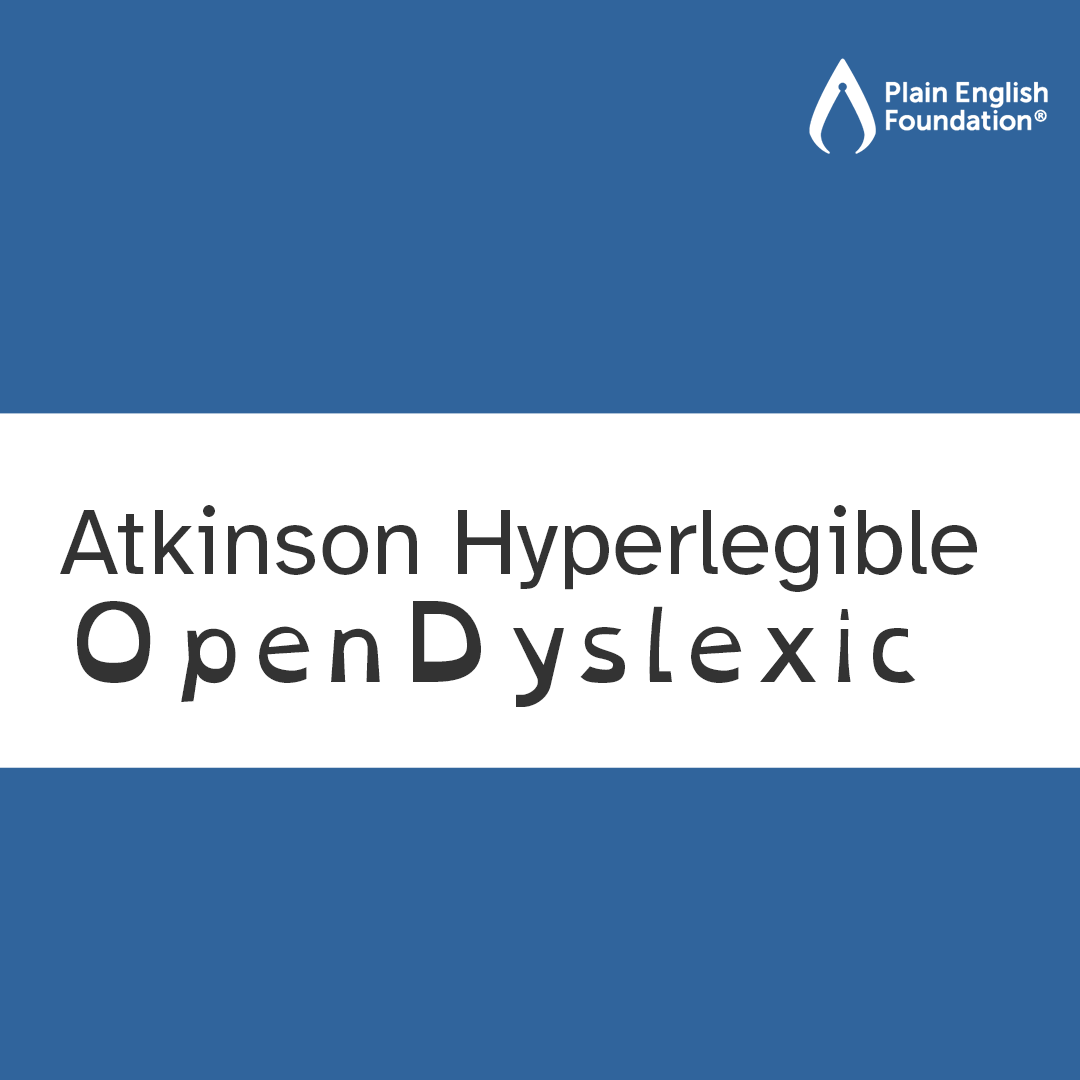
And if your readers have low vision or dyslexia, consider a typeface for them, such as Atkinson Hyperlegible or OpenDyslexic.
Curious about making your communications more legible? Contact us about our training and editing services today.